Designing for Emotional Impact: Creating Memorable Experiences through Visual Elements
Designing with both beauty and practicality in mind is common in the world of web design.
However, what sets exceptional design apart is its ability to evoke emotions.
Designing for emotional impact is a powerful tool that not only captures attention but also leaves a lasting impression on the audience.
In this article, we delve into the intricacies of creating designs that resonate emotionally, providing insights and strategies for achieving this elusive yet crucial aspect of design.
Understanding the Power of Emotional Design
The Psychology of Design
Effective design isn’t just about making things look good; it’s about understanding human psychology.
Emotions play a pivotal role in decision-making, and a well-crafted design can tap into these emotions, influencing how individuals perceive and interact with a product or brand.
By incorporating principles of psychology into design, designers can create experiences that resonate with individuals on a deeper level.
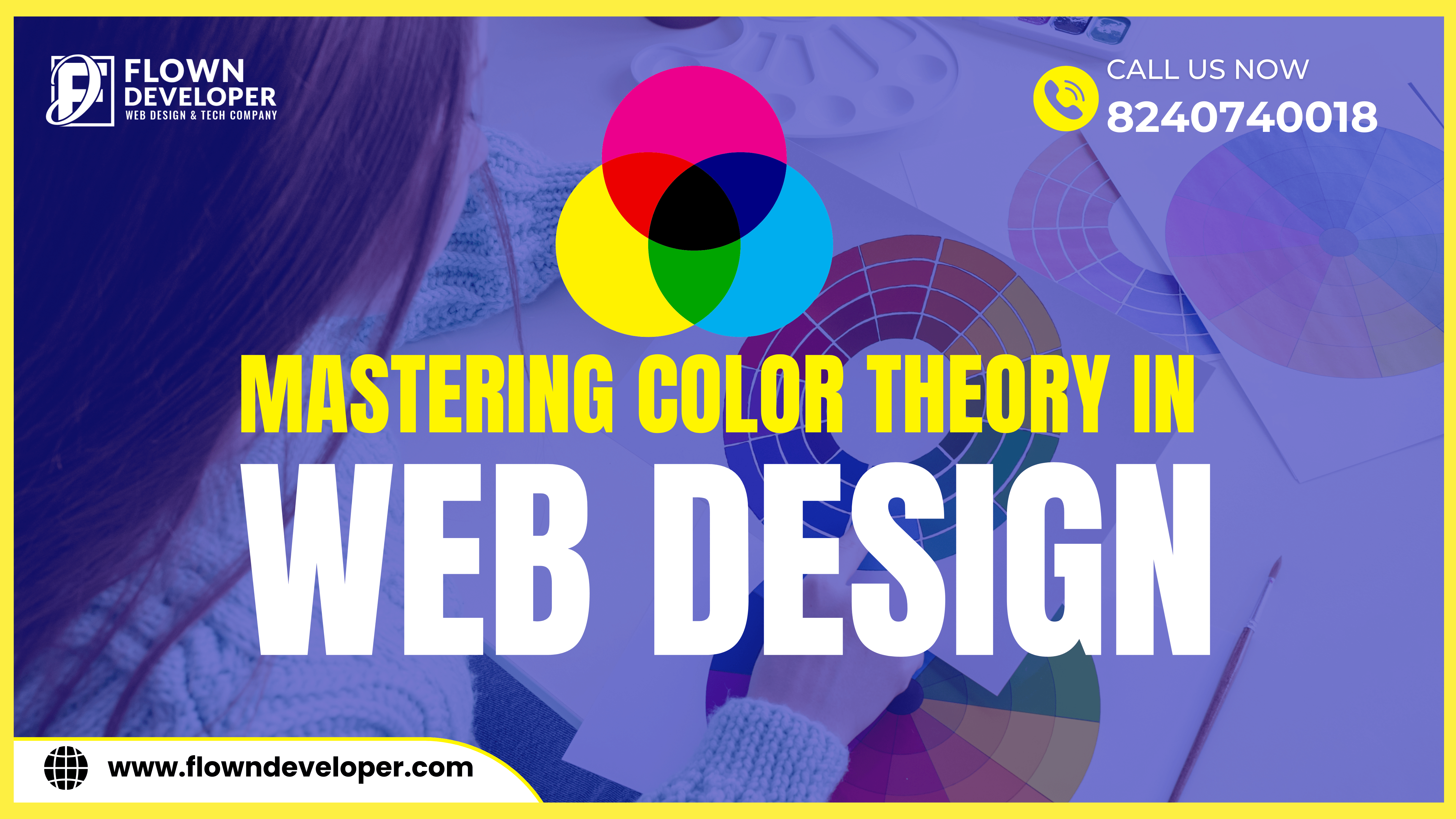
For example, using colors strategically can evoke certain emotions.
Warm colors like red and orange can elicit feelings of warmth and excitement, while cool colors like blue and green can create a sense of calmness and relaxation.
Similarly, typography plays a crucial role in conveying emotions. Script fonts can evoke a sense of elegance and sophistication, while bold and blocky fonts can convey strength and power.
By understanding the psychological impact of different typography choices, designers can align the visual elements with the intended emotional tone.
Furthermore, the placement and visual hierarchy of elements can guide the user’s attention and influence their decision-making process.
By using visual cues such as size, color, and placement, designers can draw attention to important information and guide users towards specific actions.
This can be particularly effective in the context of marketing and advertising, where designers aim to influence user behavior.
Additionally, the use of imagery and visual storytelling can create emotional connections with users.
Humans are naturally drawn to narratives, and by using storytelling techniques, designers can create an emotional bond between the user and the product or brand.
This emotional connection can influence the user’s perception and play a significant role in their decision to engage with the product or brand.
Establishing a Connection
Design has the potential to form a deep, meaningful connection with the audience.
Whether it’s through color palettes, imagery, or typography, every element should be carefully chosen to convey the intended emotion and message.
Design is not just about creating something visually appealing; it is about evoking a feeling or emotion in the audience.
The choice of colors can instantly set a mood, whether it’s vibrant and energetic or calm and soothing.
Each color has its own psychological impact, and designers must consider this when selecting a color palette.
Imagery is another powerful tool in design.
The selection of images can instantly communicate the intended message and create a connection with the audience.
A well-chosen photograph or illustration can convey complex ideas or evoke specific emotions, allowing the audience to relate to the design on a deeper level.
Typography is often an underestimated aspect of design, but it plays a key role in conveying the intended message.
Different font styles have different personalities and can help shape the tone of the design.
Typography also affects readability and can either enhance or hinder the audience’s understanding of the content.
Every element in design should be intentional and contribute to the overall message.
Whether it is the layout, composition, or choice of materials, each decision should support and reinforce the intended emotion and narrative.
Through careful consideration and thoughtful design, designers can create a deep, meaningful connection with their audience, leaving a lasting impression.
Key Elements for Emotionally Impactful Design
1. Color Psychology
Colors have the capacity to elicit strong emotional responses.
For instance, warm tones like reds and yellows can convey excitement and passion, while blues and greens evoke calmness and trust.
Understanding color psychology is crucial in setting the desired emotional tone.
Color psychology is looking at how color affects human behavior and sentiment.
It recognizes that different colors have the power to elicit certain feelings and perceptions in individuals.
This knowledge can be applied in various fields such as marketing, branding, interior design, and art.
Warm colors such as red, orange, and yellow are associated with energy, enthusiasm, and stimulation.
They can create a sense of urgency and excitement, making them suitable for promoting sales or attracting attention.
For example, many fast-food chains use red and yellow in their logos and establishments to stimulate appetite and create a sense of urgency.
Cool colors such as blue, green, and purple are renowned for their calming and soothing qualities.
They are often linked to trust, tranquility, and stability.
That is why hospitals and healthcare facilities often use blue and green tones in their interiors to create a peaceful and reassuring environment.
Different cultures and individuals may also have different associations with colors based on their experiences and cultural backgrounds.
Therefore, it’s important to consider the context and target audience when choosing colors for a specific purpose.
Understanding color psychology allows designers, marketers, and artists to strategically use colors to evoke desired emotions and create certain atmospheres.
Whether it’s creating a website, designing a logo, or decorating a space, choosing the right colors can significantly impact people’s perceptions and responses.
2. Imagery and Visual Elements
The selection of images, illustrations, and other visual elements is paramount in creating emotional resonance.
A well-chosen image can tell a story, elicit empathy, or evoke nostalgia, leaving a lasting impression on the viewer.
Visual elements have the power to connect on an emotional level and evoke visceral responses in viewers.
When selecting images, illustrations, or other visual elements, it is important to consider the intended emotional impact.
Firstly, a well-chosen image can effectively tell a story.
It can capture a moment, convey a narrative, or depict a sequence of events.
By selecting an image that aligns with the intended message or story, it can engage the viewer’s imagination and prompt them to create their own narrative.
This storytelling aspect allows for a deeper connection with the viewer as they become emotionally invested in the visuals.
Additionally, the choice of visual elements can elicit empathy from the viewer.
Using images that depict relatable situations, emotions, or experiences can create a sense of understanding or compassion.
This empathetic response can foster a stronger emotional connection between the viewer and the content, making it more memorable and impactful.
Moreover, visual elements also have the power to evoke nostalgia.
Using images that tap into shared cultural or personal memories can evoke a sense of nostalgia in viewers.
This feeling of wistfulness or sentimental longing can trigger a flood of emotions and memories, creating a deep emotional resonance.
Ultimately, the selection of images, illustrations, and other visual elements plays a vital role in creating emotional resonance.
By choosing visuals that effectively tell a story, elicit empathy, or evoke nostalgia, content creators have the ability to leave a lasting impression on the viewer.
These emotional connections can enhance the overall impact of the content and make it more memorable.
3. Typography and Fonts
Font selection can significantly influence how a message is interpreted.
Bold, elegant fonts may convey strength and confidence, while playful, handwritten fonts can evoke a sense of whimsy and creativity.
Additionally, serif fonts such as Times New Roman or Garamond can give a more traditional and authoritative feel, whereas sans-serif fonts like Arial or Helvetica can appear modern and clean.
The size of the font can also play a role in perception, with larger fonts giving a sense of importance and emphasis, while smaller fonts can be seen as more subtle and intimate.
Overall, the choice of fonts should align with the desired tone and purpose of the message being communicated.
4. Layout and Composition
The arrangement of elements on a page or screen can guide the viewer’s eye and influence the emotional response.
Balance, proximity, and hierarchy all contribute to the overall emotional impact of the design.
It helps create a sense of stability and equilibrium, and can be achieved through symmetrical or asymmetrical arrangements.
A balanced composition can evoke feelings of order, calmness, and harmony.
Proximity refers to grouping related elements together.
By organizing content in close proximity, it helps create a visual relationship between them.
This helps viewers understand the relationships and connections within the design, and can elicit emotions such as cohesion, unity, and organization.
A hierarchical structure is one where elements are arranged according to their level of significance.
It helps guide the viewer’s attention and creates a sense of visual hierarchy.
By emphasizing certain elements over others, hierarchy can evoke emotions such as importance, prominence, and authority.
These design principles, when applied effectively, can significantly impact the emotional response elicited from a design.
Whether it’s creating a sense of tranquility through balanced compositions, conveying a sense of organization through proximity, or capturing attention through a clear hierarchy, the arrangement of elements plays a crucial role in influencing the emotional impact of a design.
Implementing Emotional Design Strategies
User-Centered Design
Putting the user at the center of the design process is fundamental in creating emotionally resonant experiences.
Understanding the needs, preferences, and pain points of the target audience allows for the creation of designs that truly connect.
By putting the user at the center, designers can gain invaluable insights into their target audience.
This involves conducting user research, such as interviews, surveys, and observations, to understand their behaviors, motivations, and goals.
With this knowledge, designers can create personas, which are fictional representations of their target users.
Personas help designers empathize with users and make design decisions that cater to their specific needs and preferences.
Designing with the user in mind also involves creating user journeys or experience maps.
These visual representations outline the different touchpoints and interactions users have with a product or service.
It helps designers identify pain points and opportunities for improvement.
Furthermore, involving users in the design process through techniques like co-creation and usability testing is crucial.
Co-creation allows users to participate in the design process, providing feedback and insights that can lead to better solutions.
Usability testing involves observing users interacting with prototypes or finished designs to identify any issues or areas for improvement.
By actively involving users in the design process, designers can create emotionally resonant experiences.
When users feel like their needs are understood and addressed, they are more likely to form positive emotional connections with the products or services.
This, in turn, leads to increased customer satisfaction, loyalty, and even advocacy.
A/B Testing for Emotional Impact
A/B testing allows designers to compare different design variations and assess their emotional impact on users.
This data-driven approach helps refine and optimize designs for maximum emotional resonance.
By conducting A/B testing, designers can gather reliable data on how different design variations affect users’ emotional responses.
This allows them to assess the emotional impact of each variation and determine which design elicits the most positive emotions among users.
Through A/B testing, designers can compare two or more design variations by randomly assigning users to different groups and exposing each group to a different design.
They can then collect and analyze data on users’ emotional responses, such as self-reported feedback, physiological measures, or behavioral metrics.
This data-driven approach provides designers with quantitative insights into how users perceive and react to different design elements, layouts, colors, typography, and other factors.
By understanding which design variation evokes the most positive emotional responses, designers can refine and optimize their designs to maximize emotional resonance.
Optimizing for emotional resonance is important because positive emotional experiences can enhance user engagement, satisfaction, and loyalty.
A design that evokes positive emotions in users is more likely to create a memorable and enjoyable experience, leading to increased user retention and business success.
A/B testing allows designers to make informed decisions based on empirical evidence rather than relying on subjective opinions or assumptions.
It enables them to test hypotheses, identify design elements that impact emotions, and iterate on their designs to continuously improve emotional engagement with their users.
Overall, A/B testing is a powerful tool for designers to refine and optimize their designs, ensuring they resonate emotionally with users and create positive and meaningful user experiences.
Conclusion
Designing for emotional impact is a powerful tool that can elevate the user experience and leave a lasting impression.
By understanding the psychology behind design and employing strategic elements, designers can create experiences that resonate on a deep emotional level.
Remember, every design has the potential to tell a story and forge a connection.


