Mastering Color Theory in Web Design
A Brief Look Into Color History
Color has been an important part of human history and culture for centuries.
From ancient civilizations to modern times, color has been used to express emotions, convey messages, and create visual impact.
In ancient Egypt, for example, certain colors were associated with specific gods and had symbolic meanings.
In the Middle Ages, color pigments were highly valued and used to create intricate illuminated manuscripts.
The invention of synthetic colors in the 19th century revolutionized the world of art and design, allowing for a wider range of vibrant and long-lasting colors.
Understanding the historical significance of color can provide designers with a deeper appreciation for its role in web design and inspire them to explore new color palettes and combinations.
What is color theory in website design?
Color theory is the study of how colors interact with each other and how they can be used to create specific effects.
It encompasses concepts such as color harmony, color psychology, and color symbolism.
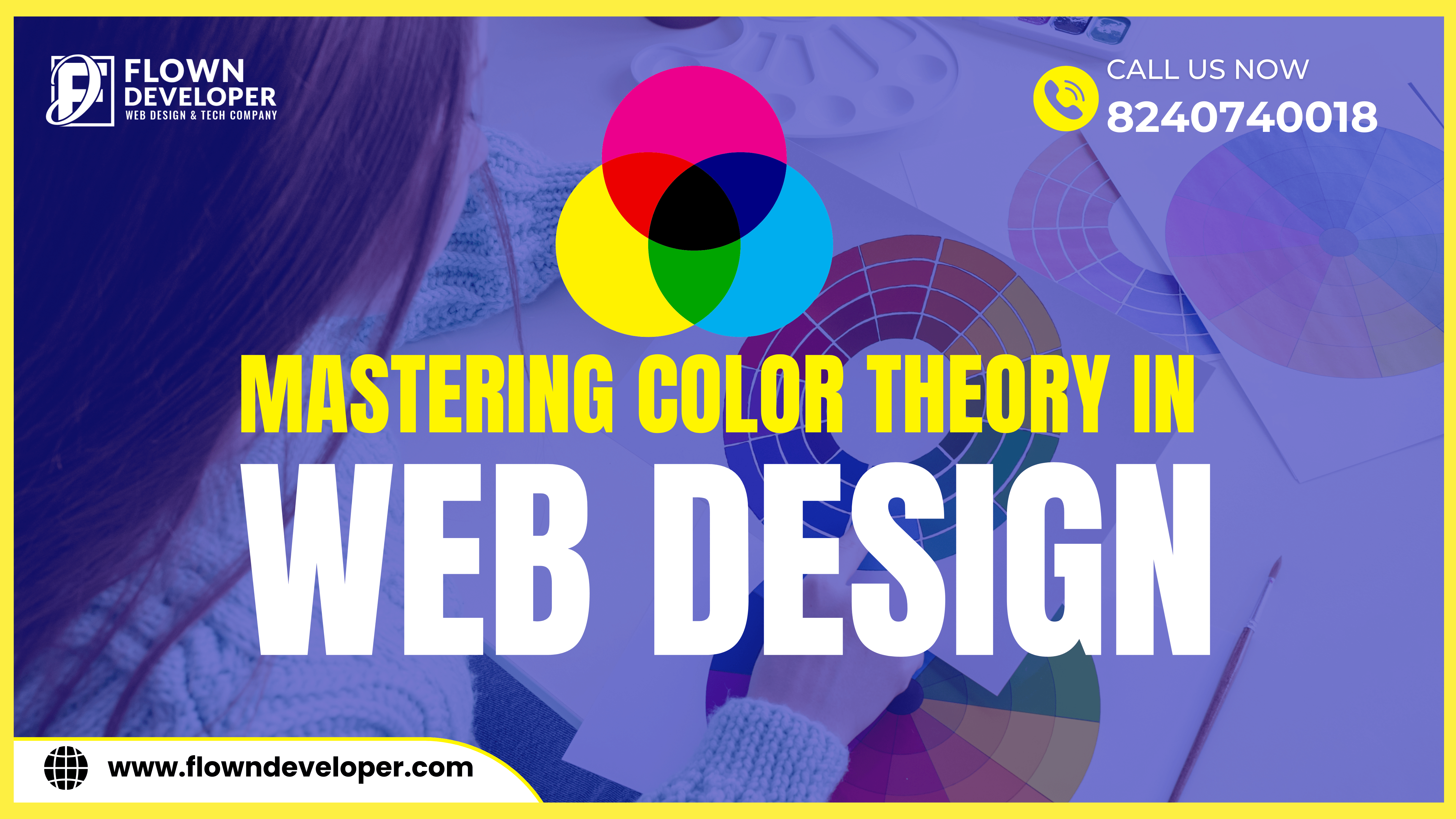
One fundamental concept in color theory is the color wheel, which consists of primary, secondary, and tertiary colors.
Primary colors, including red, blue, and yellow, cannot be created by mixing other colors and are used as the foundation for all other colors.
Secondary colors, such as orange, green, and purple, are created by mixing two primary colors.
Tertiary colors, like red-orange or yellow-green, are created by mixing a primary color with a secondary color.
By understanding the color wheel and color relationships, designers can create visually balanced and aesthetically pleasing color palettes.
Understanding Color Psychology
Color psychology explores the psychological and emotional effects of different colors.
Colors can evoke specific emotions and influence how people perceive and interact with a website.
For example, red is often associated with passion and excitement, while blue is associated with trust and reliability.
Yellow can evoke feelings of happiness and optimism, while green is often associated with nature and tranquility.
Understanding the psychological impact of colors can help designers create websites that effectively communicate the desired message and evoke the intended emotional response.
It’s important to note that color psychology can vary across different cultures and individuals, so designers should consider the target audience and cultural context when using colors in web design.
Creating Visual Hierarchy with Color
Color can be used to create visual hierarchy and guide users’ attention to important elements on a webpage.
By using contrasting colors, designers can make certain elements stand out and draw the user’s eye.
For example, using a bold and vibrant color for a call-to-action button can make it more noticeable and encourage users to take action.
On the other hand, using a muted color for less important elements can help maintain visual balance and prevent overwhelming the user.
In addition to color, other design principles such as size, typography, and spacing also contribute to creating an effective visual hierarchy.
By combining these elements strategically, designers can guide users through the content and improve the overall user experience.
The Fundamentals of Color Theory
Color theory is the study of how colors interact with each other and how they can be used to create specific effects.
It encompasses concepts such as color harmony, color psychology, and color symbolism.
One fundamental concept in color theory is the color wheel, which consists of primary, secondary, and tertiary colors.
Primary colors, including red, blue, and yellow, cannot be created by mixing other colors and are used as the foundation for all other colors.
Secondary colors, such as orange, green, and purple, are created by mixing two primary colors.
Tertiary colors, like red-orange or yellow-green, are created by mixing a primary color with a secondary color.
By understanding the color wheel and color relationships, designers can create visually balanced and aesthetically pleasing color palettes.
Choosing the Right Color Palette
Choosing the right color palette is essential for creating a visually appealing and cohesive web design.
A well-chosen color palette can evoke specific emotions, convey the brand’s personality, and improve user experience.
When selecting a color palette, designers should consider factors such as the brand’s identity, target audience, and the intended mood or atmosphere of the website.
Warm colors like red and orange can create a sense of energy and excitement, while cool colors like blue and green can evoke calmness and tranquility.
Neutral colors like gray and beige can provide a sense of simplicity and elegance.
It’s also important to consider color contrast and accessibility when choosing a color palette.
High contrast between text and background colors ensures readability, especially for users with visual impairments.
Using color contrast tools and considering accessibility guidelines can help designers create inclusive and user-friendly websites.
Color Wheel
The color wheel is a visual representation of how colors relate to each other. It consists of primary, secondary, and tertiary colors arranged in a circular format.
The color wheel helps designers understand color relationships and create harmonious color schemes.
By using colors that are adjacent to each other on the color wheel, designers can create a sense of unity and harmony.
On the other hand, using colors that are opposite each other on the color wheel can create a strong contrast and add visual interest to a design.
Exploring the color wheel and experimenting with different color combinations can help designers create unique and visually appealing web designs.
Color Relationships
Color relationships play a crucial role in web design.
Understanding how different colors interact with each other can help create harmonious and visually appealing websites.
By considering color relationships, designers can choose colors that complement each other and create a cohesive design.
One important color relationship is complementary colors, which are opposite each other on the color wheel.
These colors create a strong contrast and can be used to draw attention to specific elements on a webpage.
Analogous colors, on the other hand, are adjacent to each other on the color wheel and create a more subtle and harmonious effect.
Exploring different color relationships and experimenting with various combinations can help designers create unique and eye-catching web designs.
Optimizing Color Contrast for Accessibility
Optimizing color contrast is crucial for ensuring that a website is accessible to all users, including those with visual impairments or color blindness.
A high level of color contrast between text and background colors improves readability and usability.
Designers should consider using dark text on a light background or light text on a dark background to ensure sufficient contrast.
There are various color contrast tools available that can help designers evaluate and adjust the color contrast of their designs.
Following accessibility guidelines and considering the needs of all users can result in a more inclusive and user-friendly web design.


This Post Has 5 Comments
Hi, Neat post. There’s a problem with your website in internet explorer, would check this? IE still is the market leader and a huge portion of people will miss your wonderful writing because of this problem.
Thank you for bringing this to our attention! We strive to provide the best user experience possible, and we will look into the issue with Internet Explorer compatibility right away. Your feedback is invaluable in helping us improve, and we appreciate your kind words about our writing.
I’m really enjoying the design and layout of your blog. It’s a very easy on the eyes which makes it much more enjoyable for me to come here and visit more often. Did you hire out a designer to create your theme? Excellent work!
Thank you so much for your positive feedback! We’re thrilled to hear that you are enjoying the design and layout of our blog. We actually designed the theme in-house, but if you have any suggestions or feedback for improvement, we would love to hear them. Thank you for visiting us and we look forward to welcoming you back soon!
hi
Comments are closed.